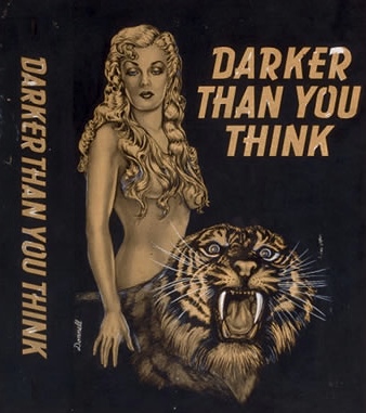
In another post (about blood moons and werewolves) I had occasion to examine the various cover paintings for Jack Williamson’s great novel, Darker Than You Think. In addition to Edd Cartier’s black and white illustration, Jeff Jones’ transmogrification of tigers and snakes, and David G. Klein’s rather literalist take on the eros and violence in the book, I was strangely charmed by the cover painting done by A. J. Donnell.
Who was A. J. Donnell, I wondered?
It turns out that I couldn’t dig up much info on him. Andrew Julian Donnell seems to have served as a Staff Sergeant in WWII, according to the gravestone in Fort Scott, Bourbon County, Kansas, which gives his dates as 1905 to 1991. The ISFDB indicates that he was born in Kansas City, about 90 miles north of where he was buried. After his stint in WWII, A. J. Donnell was living in Reading, Pennsylvania, where he was an artist working for the Glidden Paint Company. According to Lloyd Arthur Esbach’s account of how he founded the Fantasy Press, Donnell was one of the first four investors, who teamed up to put in $500 each in order to launch the company.
As Esbach tells it, he was kicking the idea around with his co-worker, G. H. MacGregor, who said: “We could get Donnell here”—the artist who was in the room at the time—“and he could do the illustrating. Maybe add Leman Houck—he’s a bookkeeper—and with each of us putting in five hundred we’d be on our way.” (see “The Fantasy Press Story” published in Earl Kemp’s eI27, Aug 2006)
But hardly anything else is known about the artist.
The Science Fiction Encyclopedia provides a thoughtful reflection on his art.
Donnell’s covers tended to emphasize simply drawn designs, but these often seemed perfectly appropriate for the material; his stark, sometimes monochromatic renderings of spacecraft for the covers for Smith’s Space Operas, for example, capture the unpolished energy of this work much better than later, more sophisticated artwork. Also, although Robert Weinberg reports that Donnell had little attachment to sf, he apparently read the books he illustrated with unusual care, as indicated by his cover for Heinlein’s _Beyond This Horizon, since its image of a boy playing with sand inside an hourglass perfectly captures the novel’s central theme: a long effort to craft a superior human being through generations of careful breeding. Similarly, his arresting cover for Stanley G Weinbaum’s A Martian Odyssey and Others_, showing a masked Egyptian bowing toward a birdlike Martian, cleverly illustrates Donnell’s awareness of the theory expressed in Weinbaum’s “Valley of Dreams”, that Martians like his Tweel had visited ancient Egypt to be received as gods.
(see SFE A. J. Donnell)
Robert Weinberg, in his Biographical Dictionary comments that Donnell was the staff artist for The Whilhelm Ambassador, whatever that was. I found a 1939 copyright entry for a periodical called “Wilhelm ambassador,” so I suppose that was it. But, apparently whatever Donnell created for that publication is long forgotten.
Not the case for his science fiction art, which is sleek, polished, and memorable. If the cover for Stanley Weinbaum’s The Black Flame doesn’t knock your socks off, then I can’t help you!
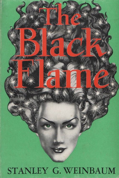
Since Donnell was both the art director and illustrator for the early Fantasy Press covers, he was designing the covers, lettering them, and probably setting up the color separations as well. His simple and yet effective use of the cover designs — in this case with red letters floating over a woman’s towering (and sparkling!) coiffure — is typically something that would have artist and art director strangling each other over an office desk. But here, on the soft green background, it just works!
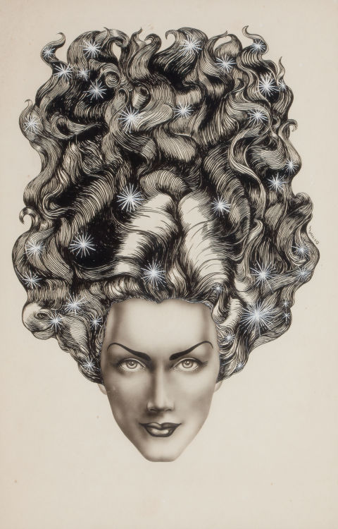
You can see where he was going with the original illustration, contrasting the soft gradient of the skin tones that had a hint of warmth, against the vivid strokes of black india ink swirling through the woman’s hair. Adding the sparkling white stars to soften the crisp lines, also showed off Donnell’s technical skill as an illustrator.
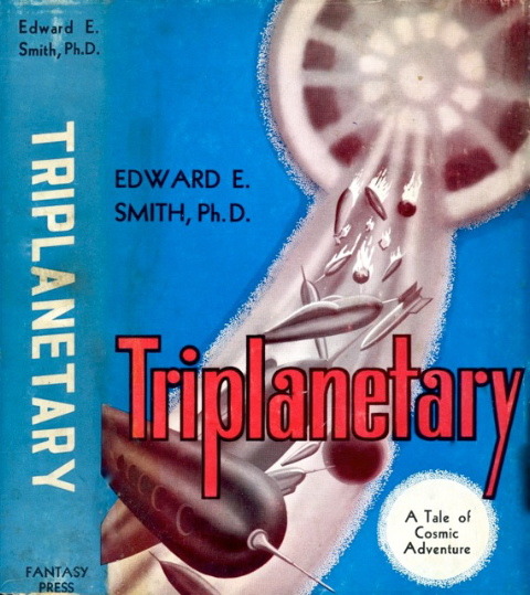
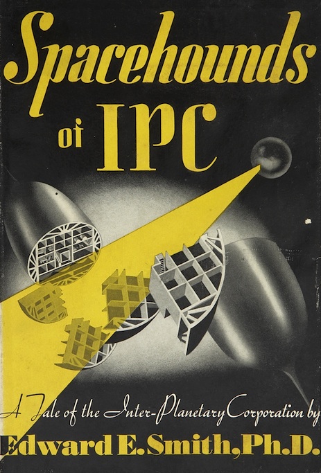
The ravages of war in space are neatly depicted in Donnell’s painting for Triplanetary, first book in Doc Smith’s Lensman series. Here the use of airbrush, oil, and hand-painted lettering is simply fantastic. The smooth cylinders of the spaceships are tumbling through the sky like so many compressed air tanks, some of them bursting into flames or burnt into useless chunks of smoldering metal. This band of destruction is emanating from a mandala-like shape hanging in the sky — apparently the Nevians spaceship unleashing their death ray that melts all it touches into an allotropic iron plasma. There is an exceptional subtlety in the way Donnell has used a simple, blurry geometric shape to represent the superior alien race.
Once again, the boldness with which Donnell framed the colorless death ray against a bright blue sky, and the way he slashed across the action with a boldly outlined red title demonstrates what an artist is willing to do when focused on the the impact of the complete design, rather than just the painting.
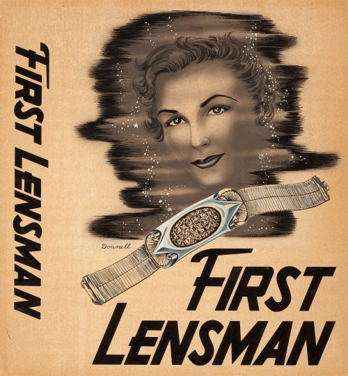
Another curiosity, is Donnell’s unused cover design for First Lensman. In this cover, the lens — a device that super-amplifies the mental powers of the wearer — looks like a fancy wristwatch, with a luxurious band. The anonymous face, floating in space behind the lens, and the trickles of stars floating around it look more like bubbles in water than stars. Clearly this design was not going to make for a stunning cover. The lettering was pretty neat, though!

It’s worth noting the cover that Donnell painted for Sinister Barrier. As mentioned in the SFE article, Donnell was clearly reading the books that he illustrated, for here we see the evil Vril as floating orbs hovering over and impinging upon a tortured, helpless human figure. This image is taken directly from the story, and is rather effective as a design, though not a very strong as an illustration.
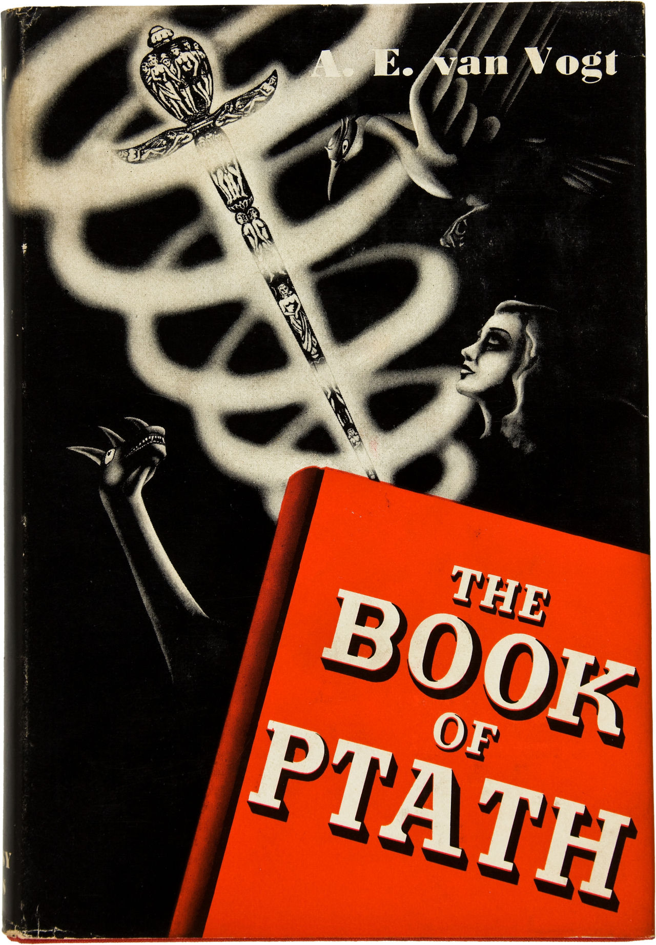
On a similar note, the cover for Book of Ptath, is a great design with uneven work in the illustration itself. Almost characteristic to Donnell’s style, there are elements rendered in tight delineation, such as the ornamental sceptre, while surrounding it is a vague blurry ray, in this case spiraling upward as an ethereal beam of light. The occult symbology here, like that of a tarot card, is perfect for the subject matter, the arcane Book of Ptath, which is hastily tossed in as a “book” shape in the corner. Though the illustration is not particularly strong, the occult theme is effective, while the strong red and black shapes hit you like a punch in the nose.
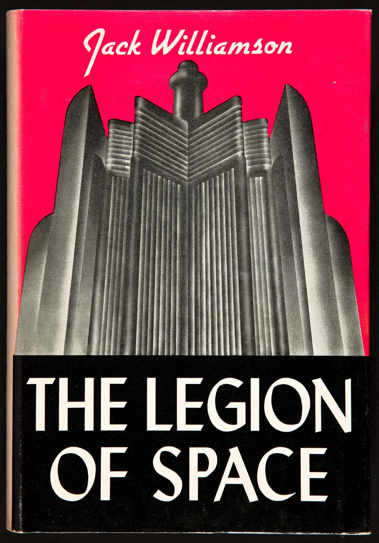
Finally, I would like to mention Donnell’s interpretation of The Legion of Space, which is nothing more than a sleek looking tower, rising in cold and windowless arrogance into a hot pink sky. It has a clean, art deco streamlined look. The font on the huge black band (which does not seem hand-written) that takes up nearly a third of the cover area, is crisp and perfect, as is the longhand script for the author’s name floating at the top. The simplicity and power of this book jacket design should have Chip Kidd slapping his forehead in awe and admiration. It is just sleek, pristine, arresting. Few covers from small presses in the 1950s could touch those of A. J. Donnell, and it is worth giving them another look.