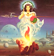
This beautiful illustration for the cover of Daughter of IS (1978), by Michael Davidson, is a wonderful example of the science fiction art of Carlos Ochagavia. The background is rendered in a light, airy tone that fades away, with major features that become transparent (in this case, a moon) . The main figure is also somewhat soft — a woman rising up in cloud — while the most tangible figure in the painting (a hand on fire!) is disembodied. In the middle distance are Ochagavia’s characteristic space-vehicles, usually saucers standing on chunky legs, and arcing behind the scene is a jet that leaves a visible trail. The image, as a whole, is strangely ethereal; is it a realistic painting, softened at the edges? Or a surrealistic painting, with a few concrete objects for our gaze to anchor upon? Ochagavia tantalizes us to find out…but often as not, the books being illustrated hold few clues as to what the artist was thinking.
Carlos Ochagavia was born in 1913, in the city Logrono, Spain, capital of the Rioja wine district, but moved with his parents at the age of two to Buenos Aires, Argentina. Ochagavia studied painting at both the Academia National de Bellas Artes and La Escuela Superior de Bellas Artes. In 1937, Ochagavia studied in New York on a scholarship from the Art Student’s League. He worked primarily as a fine artist and animator in Argentina, but has also worked as an illustrator for projects as diverse as science fiction paperbacks and commemorative stamps for the United Nations.
What got me interested in Carlos Ochagavia was the mind-blowing cover he painted for Keith Laumer’s Plague of Demons which came out in a Pocket Books edition in 1979.
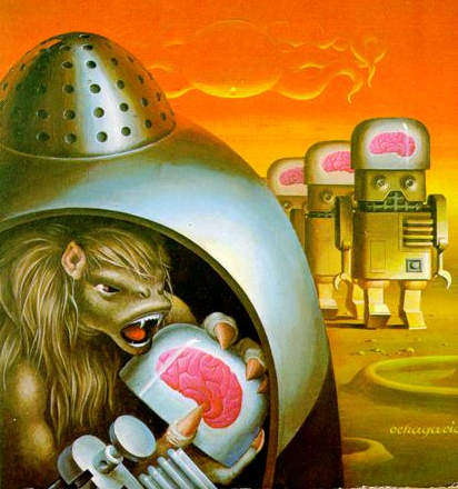
Stamping across a bright (almost gaudy) palette, a row of fanciful, chunky robots are on the march. The outline of a cosmic tentacled being floats high up in the vivid orange sky. The marching robots have hilarious bubble-gum pink brains floating sideways in transparent domes, which softens the image of a stylish humanoid who seems hungry to chomp into a recently removed robot brain. Crouched in hiding, the brain-stealing monster with his rock-star hair and oversized claws, also seems more impish than terrifying…and yet, this cover had me hypnotized in a spell of weirdness!
At that time, 1979, I quickly scouted around and found a few more covers painted by Ochagavia for Pocket Books. One of them was for Retief of the CDT, with the protagonist as a semi-transparent figure looming over an alien landscape.
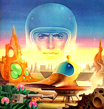
Once again the palette is startlingly bright, yet masterfully controlled into a spectrum of blue to yellow. The shapes of the landscape come into focus as they near the foreground, where unnaturally thick leaves are twisting like fat ribbons around pink globes, and hidden figure is brandishing a silly looking ray gun — sort of a mini-bike muffler stuck into a cigar box. One of Ochagavia’s typical silly space ships is center stage, like a brass-plated duck head wearing ski-goggles.
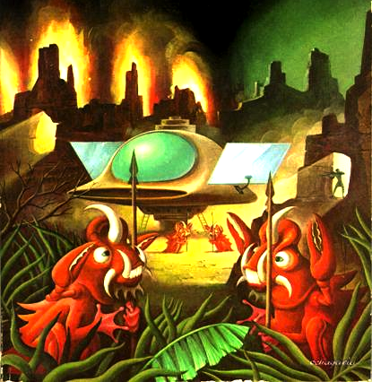
A related image is found on the cover of Retief and the Warlords, where the duck-ship has been flattened and lost a pair of side-panels. Here the background is not cooly fading into transparency, but is dramatically brought into relief by backlighting - not once, but in two separate zones of color. How strange. Almost as a throwaway, Ochagavia sketches in some very faint mounds of translucent bubbles in the middle distance, and in front of those the protagonist appears as a tiny toy soldier, brandishing a rifle from a stone archway. The delightful foreground figures in this painting are absurd aliens with white tusks and delicate frog’s hands…a set of lobster claws are tacked onto their shoulders as an absurdist afterthought! Here the fat tendrils of the plants are as unrealistic as the legs of dancers in Fernand Leger paintings.
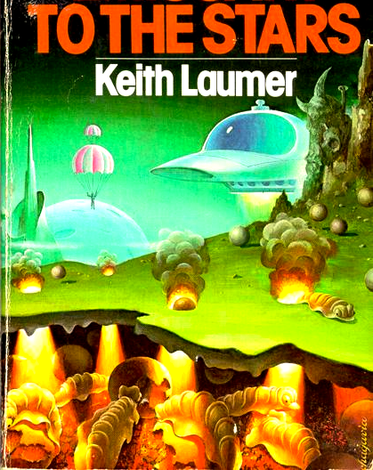
On the cover for Emissary to the Stars the same duck head space ship appears in the background, having shed its goofy side-panel wings, and swapped chunky landing struts for a soft rocket flare, it almost begins to look like a regular SF spaceship…but it’s absurdly oversized “windshield” and “topknot” remind us that this is still a realm of whimsy. The interesting aspect of this cover is that it is a cut-away view of an alien landscape, showing us the subsurface world of fanciful bugs as they are hatching out of burning spherical eggs and crawling up to the surface. The bugs are about as menacing as trilobytes or macaroni, and the protagonist is yet another toy soldier…this time riding a parachute down over a distant half-visible moon. A fine surrealistic fantasy…and an amazing insight into the mind of Ochagavia, since it is such a strange abstraction of the novel’s story.
Part of the charm of these illustrations is their disinterest in the technology of “hard” science fiction; while acknowledging the general idea of futuristic vehicles and weapons, the forms are softened and embedded in the playful surrealism of the imagery as a whole. This trick is pushed even farther in the cover for Retief’s War, where a shimmering alien city looms in the background, while the hero is disguised in a bizarre half-lobster, half-monster costume and brandishes only a wooden club.
The only technology here is an old wooden wheel, engulfed in the spectacular alien life forms: lush vegetation and harmless creatures. This painting is both a farce and a masterpiece, it’s smoothly rendered artificiality is like something Henri Rousseau might have dreamed.
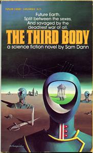
The surrealist mission is most blatant in the cover for The Third Body, where starkly rendered hollow figures loom up like figures from DeChirico, and crisp shadows delineate the shapes as they drape over a Dali dustscape, littered with old swords and disconnected forms. But the desire to carefully construct the yellow piping on the hollow-headed figure’s uniform, along with the red buttons on its neck, is very much Ochagavia’s style, as is the tracery of constellations written in the sky. The strangeness of the image is accentuated by the blue sky, green grass, and liveliness of the scene that is visible through the aperture of the hollow face, while every other angle reveals only ruins and dust. Is this time travel, delusion, an alternate dimension? Short of finding this book and reading it, I can only guess!
One of my favorite covers by Carlos Ochagavia is for The Glory Game, where the characters are portrayed as figures on a deck of playing cards floating over an alien landscape. The conceit of the idea is rendered with a masterful, almost effortless style, and is embued with a dreamy surreal power. The main figure on the largest card is portrayed as a mirror image…his hands, though gripping a futuristic rifle in one direction, also magically appear to be draped correctly when turned upside down! Sprouting from the protagonist’s spacesuit helmet is an air hose that resembles either a slender dog’s leg or a tiny elephant’s trunk, and yet his bare arms are fine, underneath the folds of a magenta vest. If we pull back our gaze to see the top and the bottom figure together, the vest forms a beautiful X through the center of the playing card.
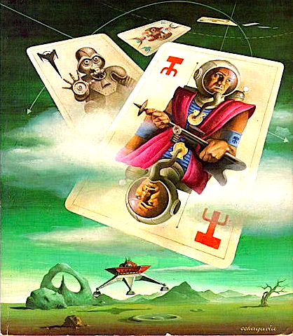
Accentuating the dream-like quality of the scene is a cloud that somehow passes through the card, so that the card, tilted back in perfect perspective, is at once in the foreground, and at the same time floating through the clouds. Alien icons have replaced the traditional suits (of clubs, hearts, spades and diamonds) in the deck, and except for a cameo appearance of Darth Vader, we are left to wonder what the other cards look like, as they fan out like feathers floating down from the distant sky. Interwoven behind the tumbling deck of playing cards are traceries of astrogation paths in the dark green sky. The only vehicle seen is a weird skimmer craft, with oversized chunky legs larger than the cabin. The alien landscape is rendered in tiny, semi-transparent shapes, fading away into the green distance, with the only sign of life being a single gnarled tree-trunk. This cover, as unusual as it is for a “hard” science fiction paperback cover, remains one of my favorites for its quiet, yet powerful dreaminess.
Finally I would like to share a full view of the excellent cover painting for Venus Development (1976), that I stitched together from a very fine copy of the original paperback (found after several years of searching). In this lush painting, the body of Venus is the landscape, her hair a waterfall, and the strange Ochagavian plants, with their golden flower globes seem to writhe over a pool of alien lotus pads. The spaceship is modestly painted in the same tone as the sky, as the dreaming figure of Venus faces the disc of planet Earth. There is hardly a word that can express the beauty of this breath-taking painting, except to say that it is crazy to think that such a masterpiece can appear once on a paperback and never be seen again! Let’s help to correct that by celebrating the works of Ochagavia here, and passing these images along to those who didn’t know about them. (click for full size image)
